It feels fairly obvious to point out that the way food looks is going to affect how much we want to eat it. Aesthetics are important when it comes to anything, especially food. Think about it: would you be more inclined to order something at a restaurant if the photo was high-quality and Instagram-worthy, or washed out and old-looking? You would almost definitely want to eat the food in the nicer picture! And apparently, the color also plays a big part in what makes you feel more hungry. There are certain shades that will made you want to eat more than others, and red is one of those. So why do you feel hungry when you see the color red? The psychology behind that is really interesting.
What it really comes down to isn’t a matter of aesthetics, but of color psychology, which dates back a very long time. Color professor J.L. Morton told Care2 that our earliest ancestors associated certain kinds of foods with specific colors: they avoided blue, black, or purple foods, associating them with toxic or spoiled objects, which could explain why, today, so many people don’t like food being the color blue. But what about red? What is it about this color make us so hungry?
Colors like red, yellow and orange make you hungry.
— Urban Truths - World Facts (@TruthsUrban) January 13, 2019
Red draws people in.
Color psychology is research that looks into how colors can influence behavior and decision making. Certain colors have also been shown to increase appetite, while red has been found to trigger powerful emotions. @lets_NEUROmkt #NMKTRCH #XPBRND pic.twitter.com/cYO2YCrRkM
— Patty van der Reijden (@PattyReijden) January 10, 2019
Red is a warm color that is known to draw people in, giving them energy and making them feel excited. Scientific American points out that seeing the color red has effects on one’s behavior, including making men perceive women wearing red as more attractive.
It also speeds up the body’s blood flow.
Today's post has been brought to you by the color RED! In color psychology, red can represent power in addition to passion and love. Brands who use this color in their logos include Coca-Cola, Netflix, and Target. What does red mean to you?#GraphicDesign #ColorPsychology pic.twitter.com/xbWgsWsvK5
— Uncover Creative (@uncovercreative) September 4, 2018
As Spoon University points out, red attracts attention and speeds up the body’s blood flow. When the blood flow is increased to the digestive system, it speeds up your metabolism and makes you hungry. It also increases your heart rate, which can jump-start your appetite., So red definitely has a powerful effect on your body and brain.
This has led to many food brands using red as their signature color.
Think about it: McDonald’s is known for their red and yellow logo. Burger King, Pizza Hut, Wendy’s, Dairy Queen, Domino’s Pizza, Arby’s, and KFC are only a few fast food restaurants that are using the color red in their branding — there has to be a reason for that.
We might just have a good experience associated with the color red.

According to Business Insider, our attraction to the color red might have more to do with how we feel about it than anything else. It could come from positive experiences linked with the color — if you have happy memories associated with the color red, like if you were rewarded with McDonald’s fries as a kid if you did something good, then you might crave that thing just based on that memory.
Red and yellow, as a combination, can make us even more hungry.
According to The Visual Communication Guy, this phenomenon is called the Ketchup and Mustard theory. The idea is that the combination of red and yellow “make the perfect visual and psychological companionship for making us want to stop and eat.”
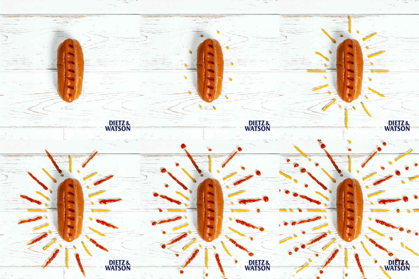
This is because red makes us feel warm, comforted, and loved, which is how a really good meal should be making us feel.
Yellow, like red, is cheery and exciting, grabs attention, and has the ability to speed up our metabolism. So when you see both colors together, it’s basically a double whammy.
Some colors, on the other hand, are thought to make us feel less hungry.
Research has shown that the color blue turns people off from food, and that black and purple colors are also ones we tend to avoid when looking at food.
Basically, what it comes down to is this: red is a color that generally makes us feel happy, attracted to something, and energetic. And when we feel those things, we can experience an increased metabolism or heart rate, both of which could make us hungry. Pretty interesting!

So the next time you notice red and yellow branding for a restaurant or food chain or food packaging, you’ll know why!

