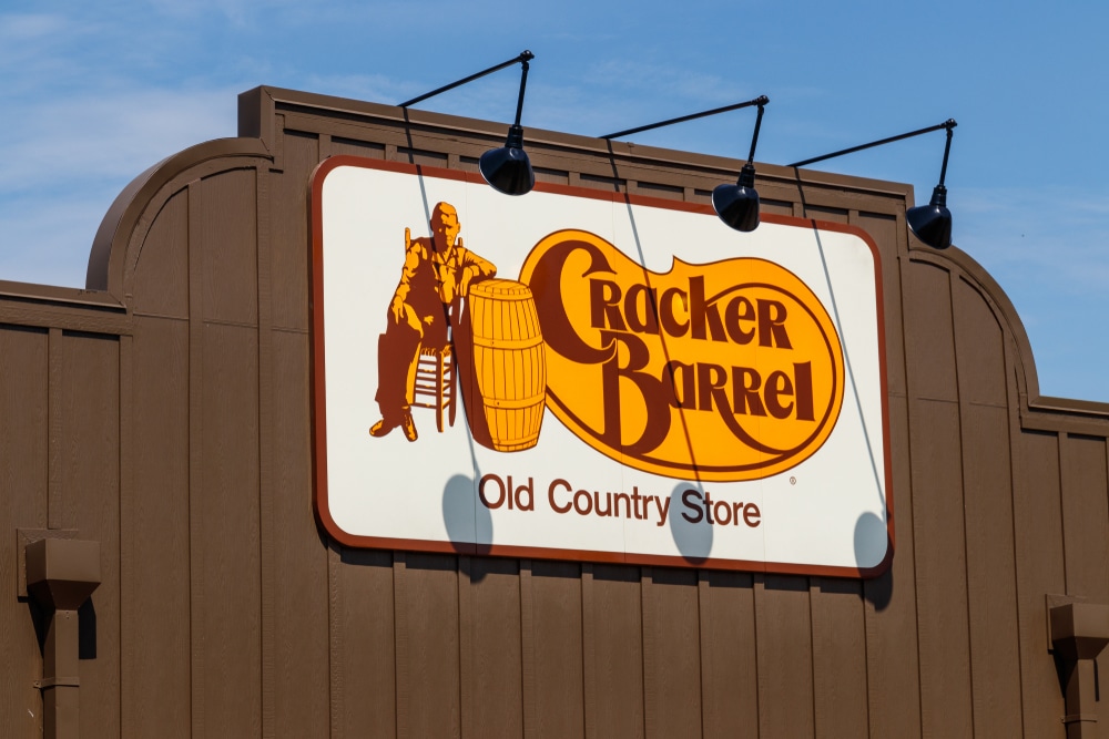
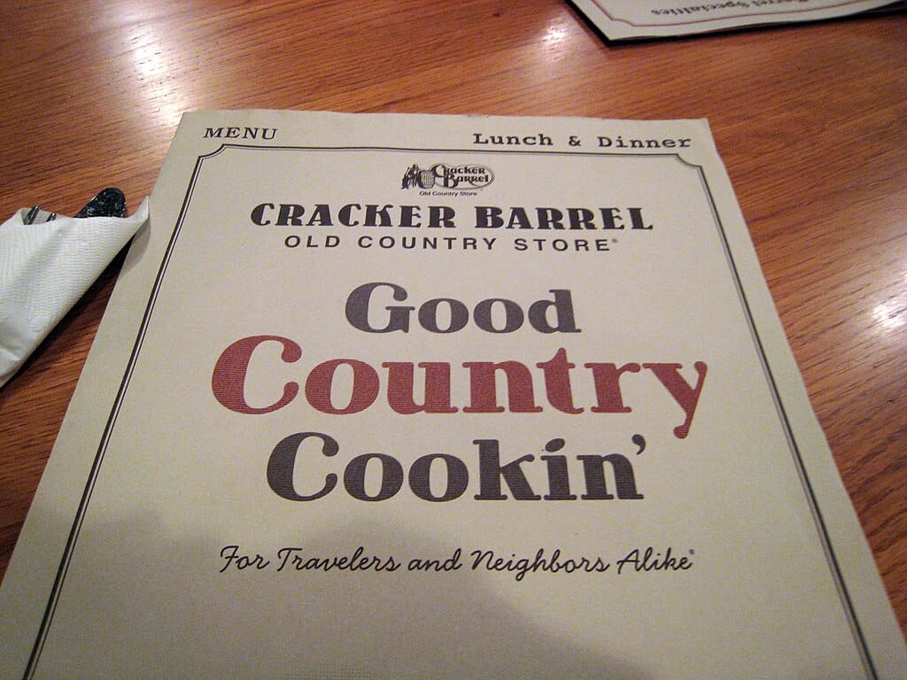
Cracker Barrel CEO Reflects on ‘Woke’ Rebrand Backlash, Saying She Felt ‘Fired by America’
Cracker Barrel’s attempt to refresh its brand was supposed to feel simple and modern, but the reaction that followed was anything but. What started as a clean, text-only logo and a brighter store concept quickly turned into a national debate, fueled by nostalgia, strong opinions, and a wave of online criticism. CEO Julie Masino later admitted the backlash felt so personal that she felt like she had been “fired by America,” opening up a conversation about what customers actually want from the chain.
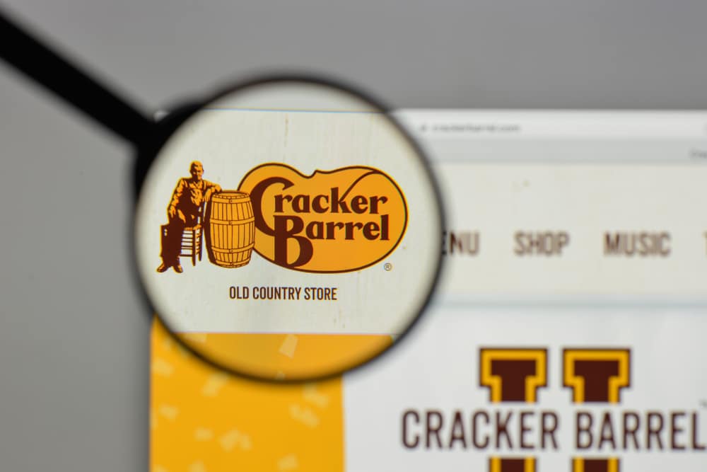
A Redesign That Sparked a Firestorm
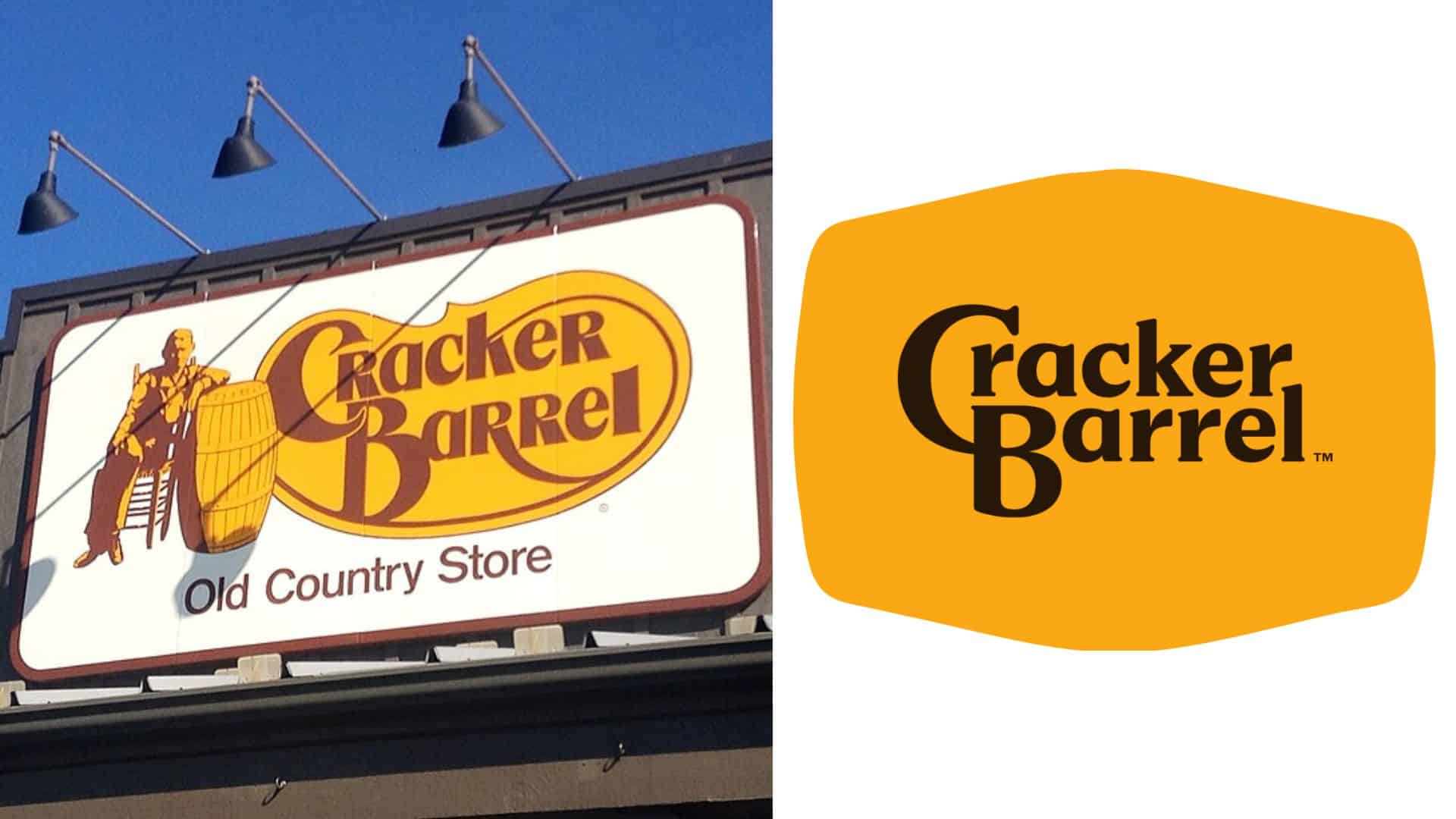
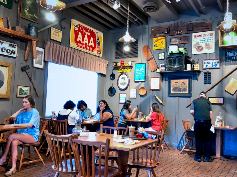
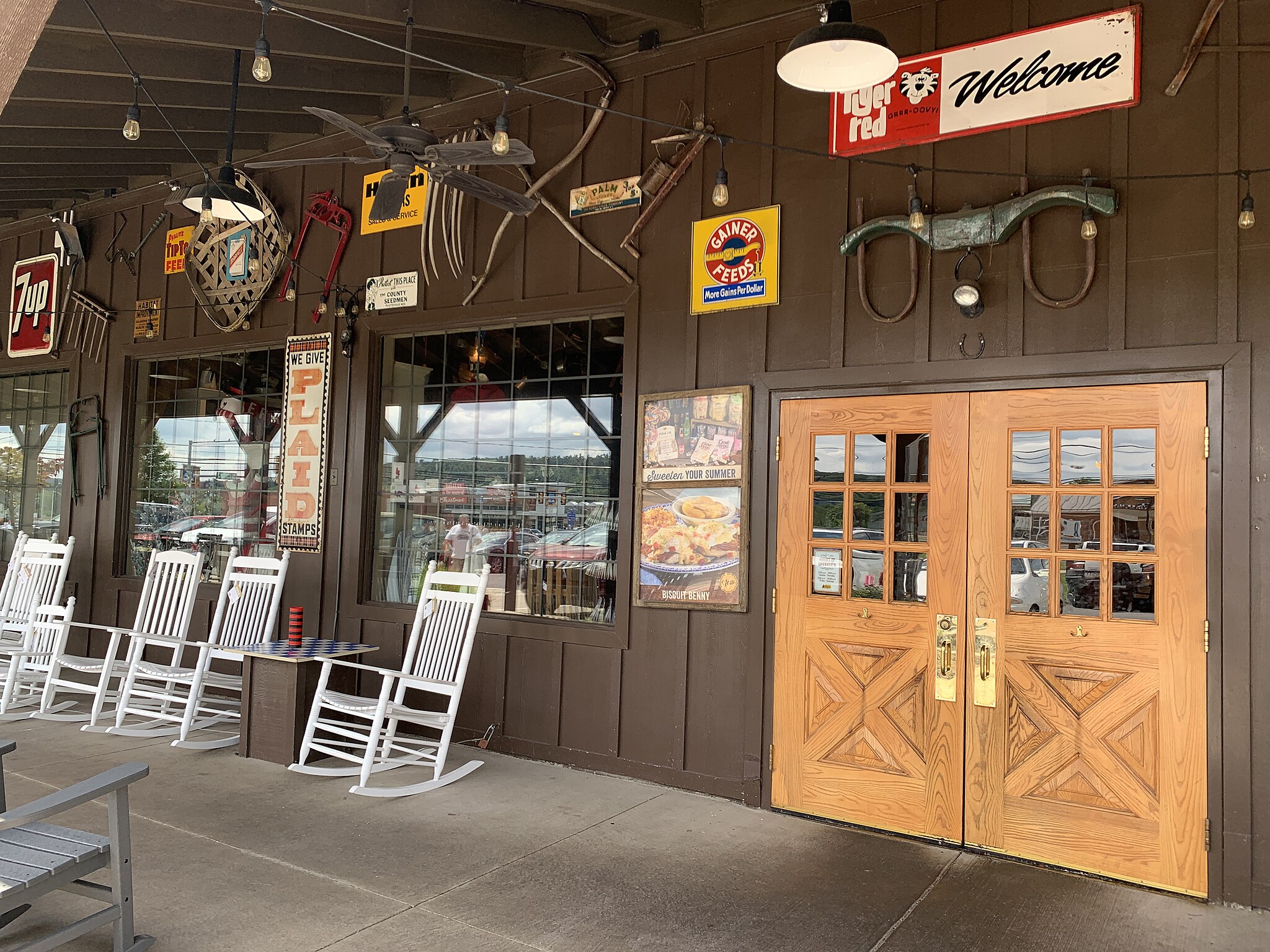
The updated logo and lighter store interiors were meant to make the brand feel easier to navigate and more welcoming. Many customers, however, felt the changes stripped away too much of Cracker Barrel’s familiar charm. Online, fans argued that the new look didn’t match the comfort and tradition they associated with the restaurant, and frustration spread quickly.
Julie Masino’s Response
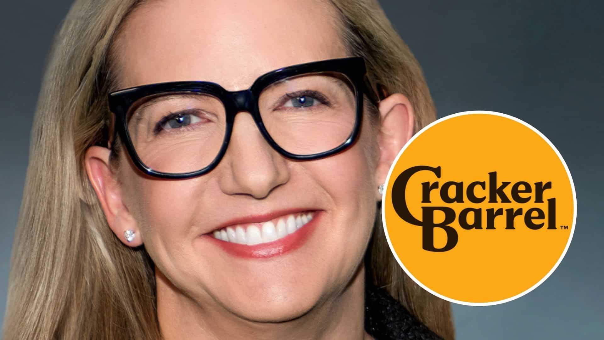
In an interview with Glenn Beck on his podcast, Masino shared how unexpectedly intense the backlash was. Beck jokingly pointed out that she still had her job, and Masino replied that she felt like she had been “fired by America.” It showed her that customers were highly invested in the brand and reacted strongly when the changes didn’t match their expectations.
What the Company Was Trying to Fix
Masino and Senior Vice President Doug Hisel stressed that the redesign wasn’t about abandoning the past. They said guests had long complained about dim dining rooms, uncomfortable seating, and menus that were hard to read — practical issues the new concept aimed to solve. The sleeker logo was chosen to improve readability across digital platforms, not to erase the iconic imagery guests grew up with.
Why Guests Felt Disconnected
What the company didn’t anticipate was how personal the reaction would be. Many customers said the redesign felt like a move away from the cozy, familiar atmosphere they associated with Cracker Barrel. The timing complicated things as well: fans were already voicing concerns about slow service, changing menus, and rising prices, so the logo shift felt like the wrong priority at the wrong moment.
Public Figures Intensify the Backlash
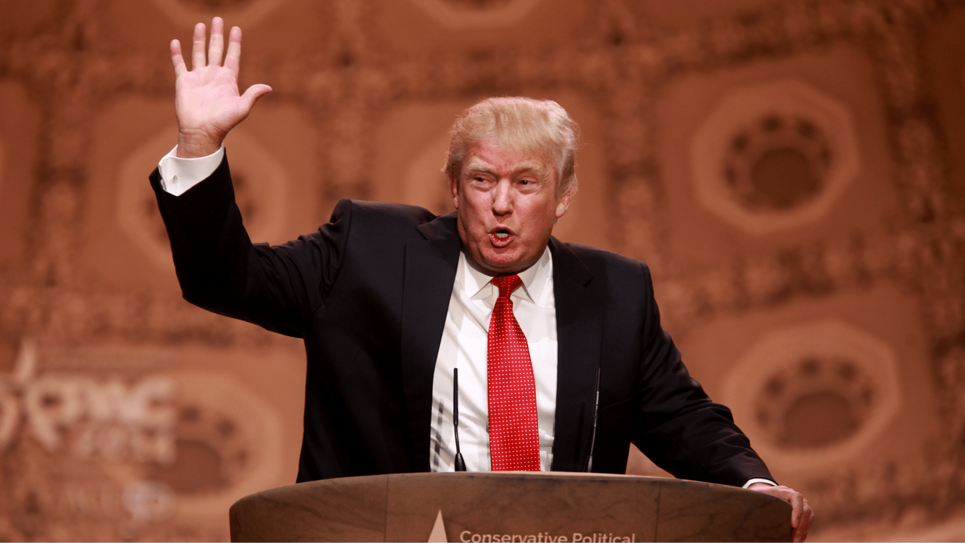
The situation escalated further when President Donald Trump publicly criticized the redesign and later celebrated the company’s reversal. His comments amplified the debate and encouraged even more people to join in. Conservative influencers and online commentators also weighed in, framing the redesign as unnecessary or ideologically charged. Branding experts joined the conversation too, calling the simplified logo a misstep that underestimated how much emotional weight customers placed on tradition. Together, these voices helped turn a branding update into a national talking point.
Operational Challenges Behind the Scenes
Masino later explained that Cracker Barrel had been facing several internal challenges long before the logo controversy. Staffing shortages, uneven service levels, and a complex menu rollout had already made it harder to deliver the consistent experience customers expected. When viewed through that lens, the frustration surrounding the redesign became easier to understand — many guests simply wanted the basics to feel solid again.
The Decision to Reverse Course
After weeks of criticism, the company announced it would keep the classic logo. The team admitted the redesign “missed the mark” and emphasized that they never intended to distance themselves from the brand’s heritage. For many guests, the reversal felt like a reassurance that Cracker Barrel was listening and still understood why people felt so attached to its traditional look and feel.
What Customers Say They Truly Want
As feedback poured in, fans made it clear the logo wasn’t what mattered most. They wanted better food, steadier service, and prices that felt manageable — the everyday things that shaped their loyalty. Masino acknowledged that the backlash underscored how important it is to truly listen to what guests are asking for.
Looking Ahead
Masino says Cracker Barrel is focusing on what makes the brand feel familiar and comforting to guests. The response to the redesign showed how much people care, and she hopes that staying closer to those roots will help rebuild trust moving forward.