Food Logos With Clever Hidden Meanings
Food brands invest years shaping their visual identity, but some of the cleverest messages are tucked into their logos. These designs quietly reflect heritage, values or playful Easter eggs, rewarding fans who look closely. From family ties to geographic nods, these hidden meanings show how logos speak long before the products do.
Wendy’s
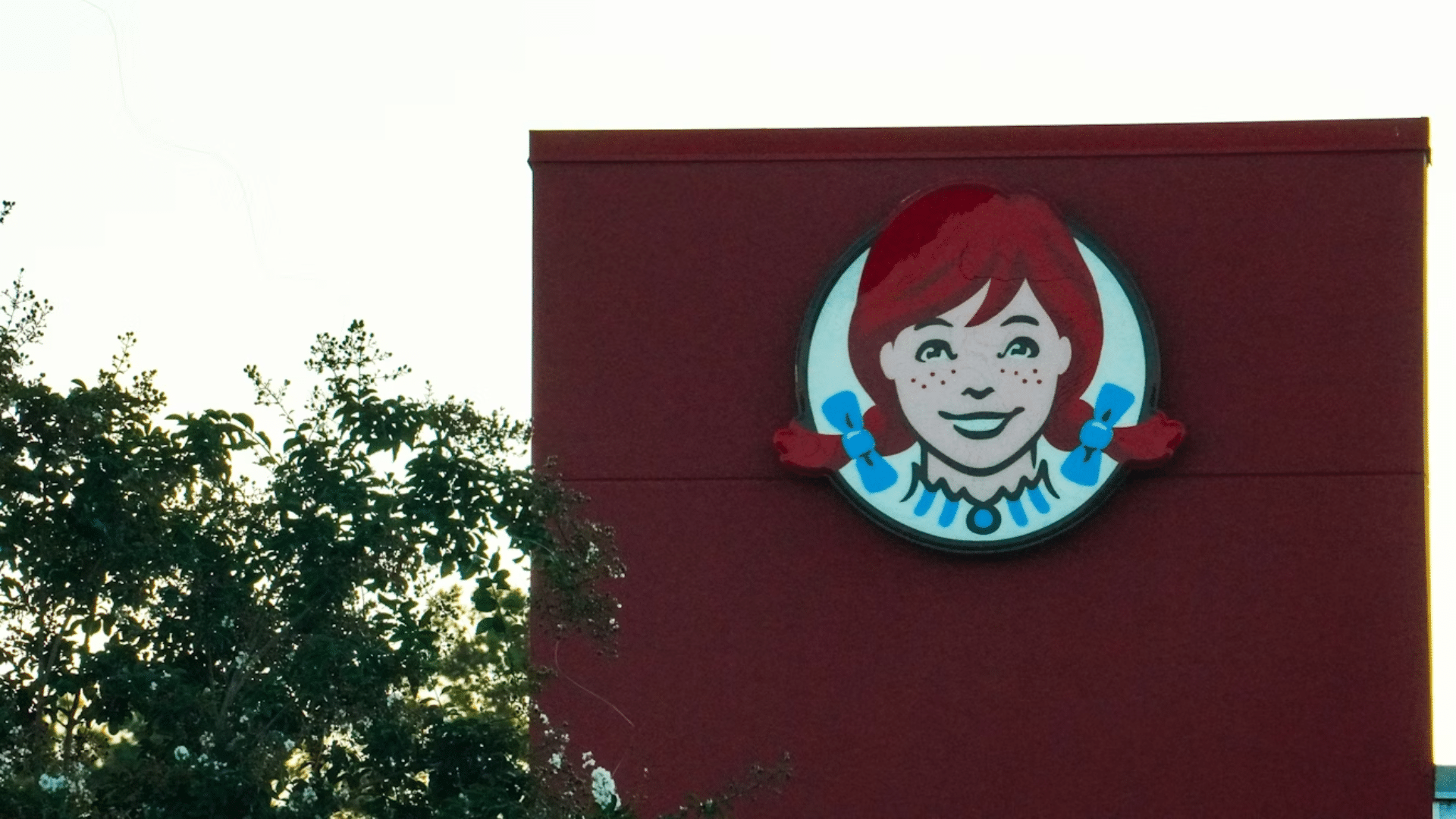
The Wendy’s brand was named after founder Dave Thomas’ daughter, who appears as the smiling redhead in the logo. Look closely at the ruffled collar, and the subtle word “mom” reveals itself, nodding to homemade meals and comfort foods. The logo’s friendliness becomes a reminder of the chain’s family origins.
Subway
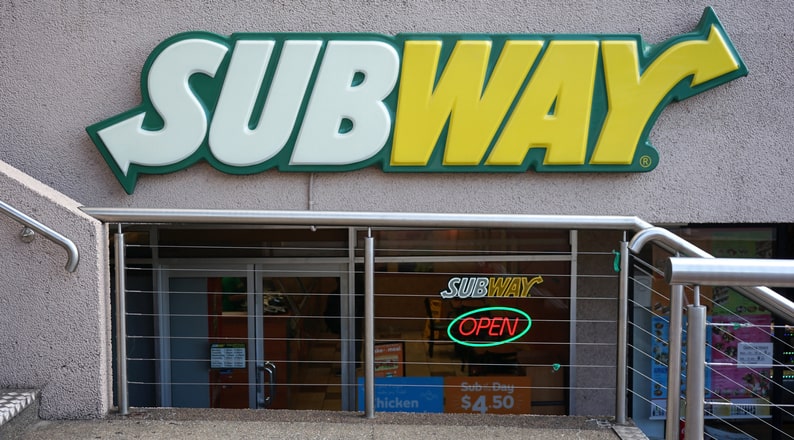
The first and last letters in the Subway logo curve into arrows, symbolizing a subway entrance and exit. The design mirrors the brand’s name and hints at fast, customizable meals made on the go. It is simple, functional and reinforces a sense of motion.
Burger King
Burger King’s visual identity takes a literal shape. The words “Burger” and “King” sit between two bun-like arcs, creating the impression of a stacked sandwich. The logo conveys what the restaurant does without needing a picture of food.
Domino’s

Domino’s familiar three-dot logo was originally meant to track store growth. The founders used three dots to represent their first three locations, planning to add more with each new store. Expansion happened faster than expected, and the company kept the original motif as a tribute to its beginnings.
Starbucks
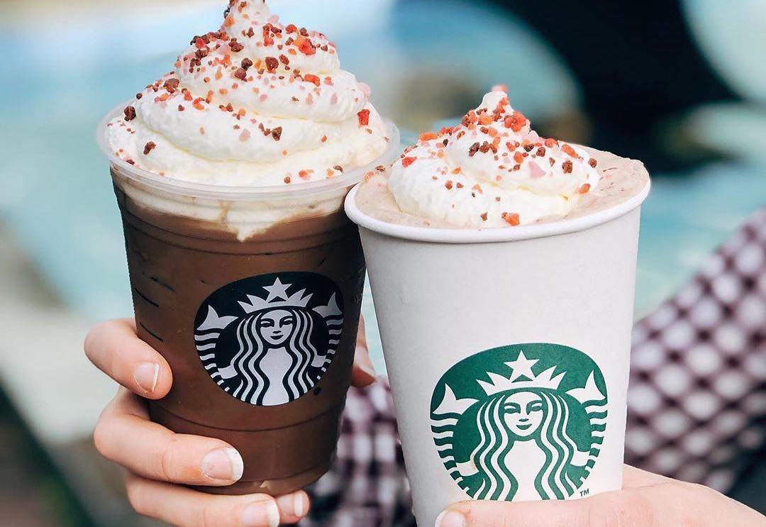
Starbucks’ queen-like siren draws from maritime folklore and early coffee-trade imagery. The figure references the company’s Seattle roots and evokes a sense of journey and indulgence. It is not a literal coffee symbol, but an invitation: a cup of coffee as a moment of escape.
Toblerone
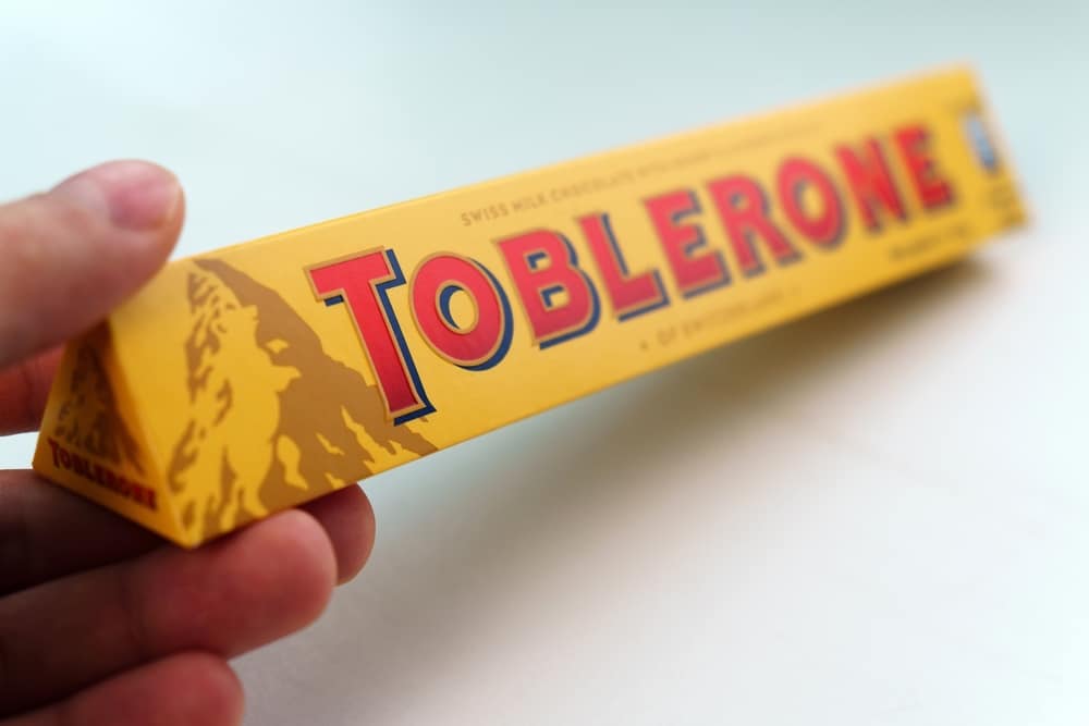
The Toblerone mountain logo reflects the candy’s Swiss origins. Embedded in its silhouette is the outline of a bear, a nod to Bern, the city associated with the animal and the birthplace of the company. The chocolate’s triangular shape echoes the peaks that inspired it.
Hershey’s Krackel
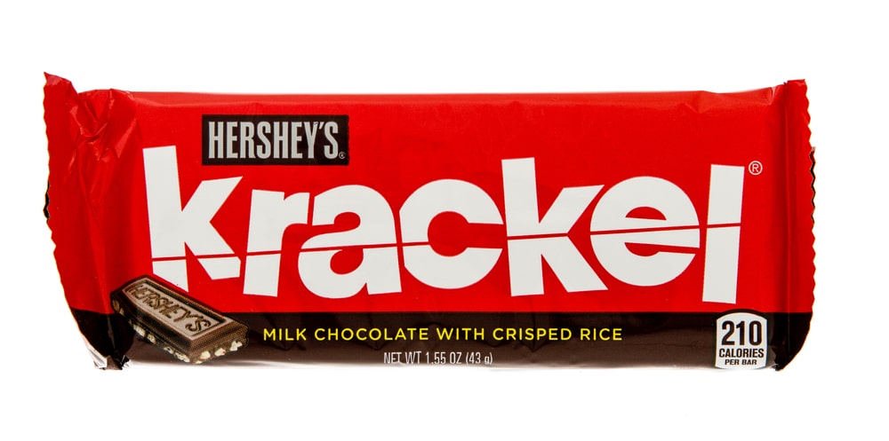
The Krackel bar’s design leans into perception rather than a literal icon. Its crisped rice texture inspired packaging that emphasizes sharp lines and fast energy, visually “crackling” like the product name. The style reinforces the bar’s snap-and-crunch identity.
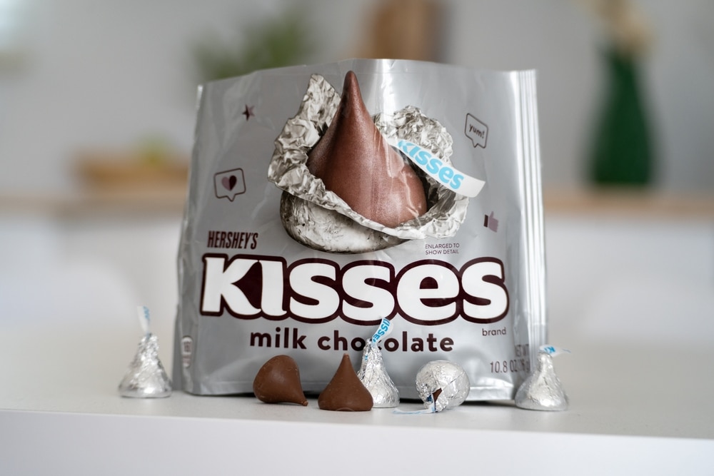
Hershey’s Kisses
Between the “K” and the “I” in the Hershey’s Kisses logo, a small chocolate sits upright if you tilt your head to the left. The visual plays with perspective, offering a bonus Kiss between the printed letters. It mirrors how the candies themselves are nestled together in each bag.
Baskin-Robbins
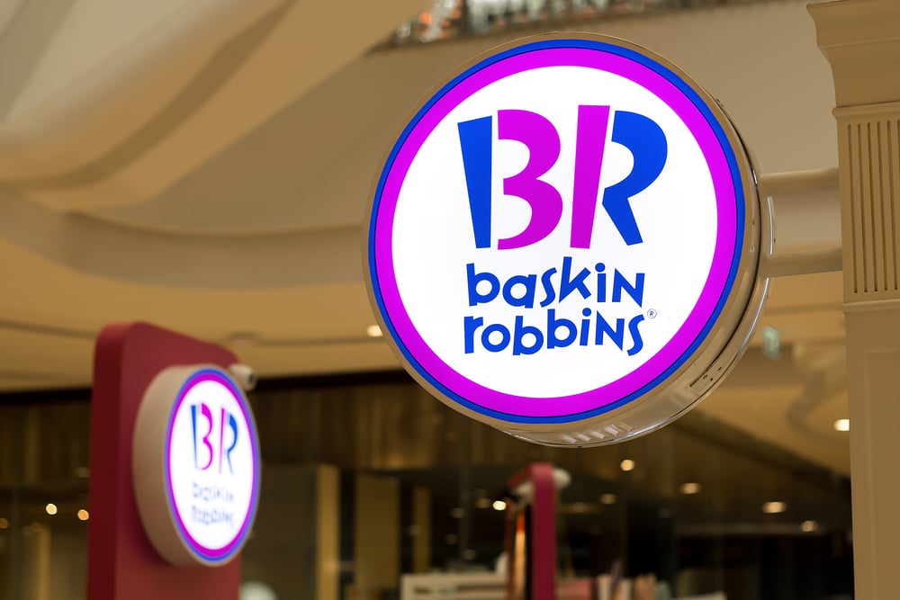
Baskin-Robbins famously launched with 31 flavors, and the number is built into its logo. The pink shapes formed by the “B” and the “R” outline 3 and 1, hinting at variety and discovery. The brand treats ice cream as a playful adventure rather than a single choice.
Nestlé
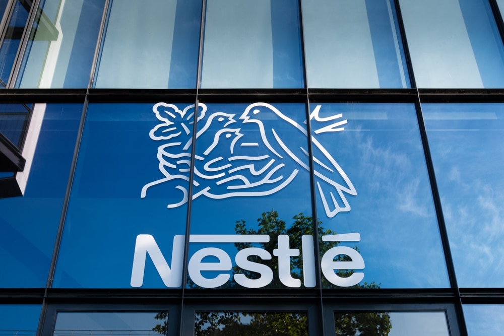
Henri Nestlé incorporated the bird’s nest from his family coat of arms into the company’s identity. The logo shows a parent bird feeding hatchlings, reflecting nourishment and care. It communicates the brand’s original mission before a single product is sold.
Tostitos
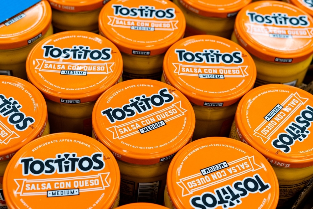
The center of the Tostitos wordmark turns two “T” letters into figures sharing a chip. The “I” becomes a bowl of salsa, making a miniature table scene. It frames the brand around connection, not just corn chips and dips.
Heinz
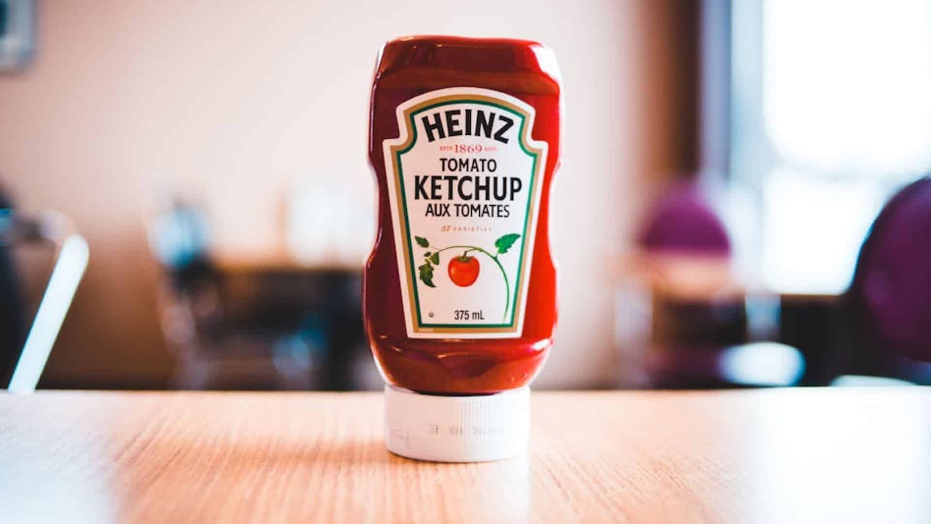
Heinz bottles prominently display “57 Varieties.” The number never reflected actual product count. Founder Henry John Heinz favored the number five, and his wife favored seven, combining them into a memorable mark of brand luck and identity. Consumers saw variety, but the logo was always about personality.
More Than Symbols, They’re Stories
The symbols in these food logos are not accidents, nor are they simple decorations. Each one carries a message about heritage, values or the emotional experience a brand hopes to create, whether it is family comfort, exploration or shared enjoyment. When logos are designed with intention, they become more than marketing—they become stories that shoppers remember every time they open a wrapper or step into a restaurant.