Long John Silver’s Debuts New Logo — Dubbed “Branding Fail” As Chain Replaces Iconic Animal
Long John Silver’s has launched a bold new look — and not everyone’s on board.
The seafood chain’s freshly revealed logo swaps its signature fish for a chicken, sparking backlash online. The redesign, which adds a “Chicken + Seafood” tagline, aims to spotlight the brand’s underrated chicken menu — but longtime fans say it misses the mark.
A Rebrand That Ruffled Feathers
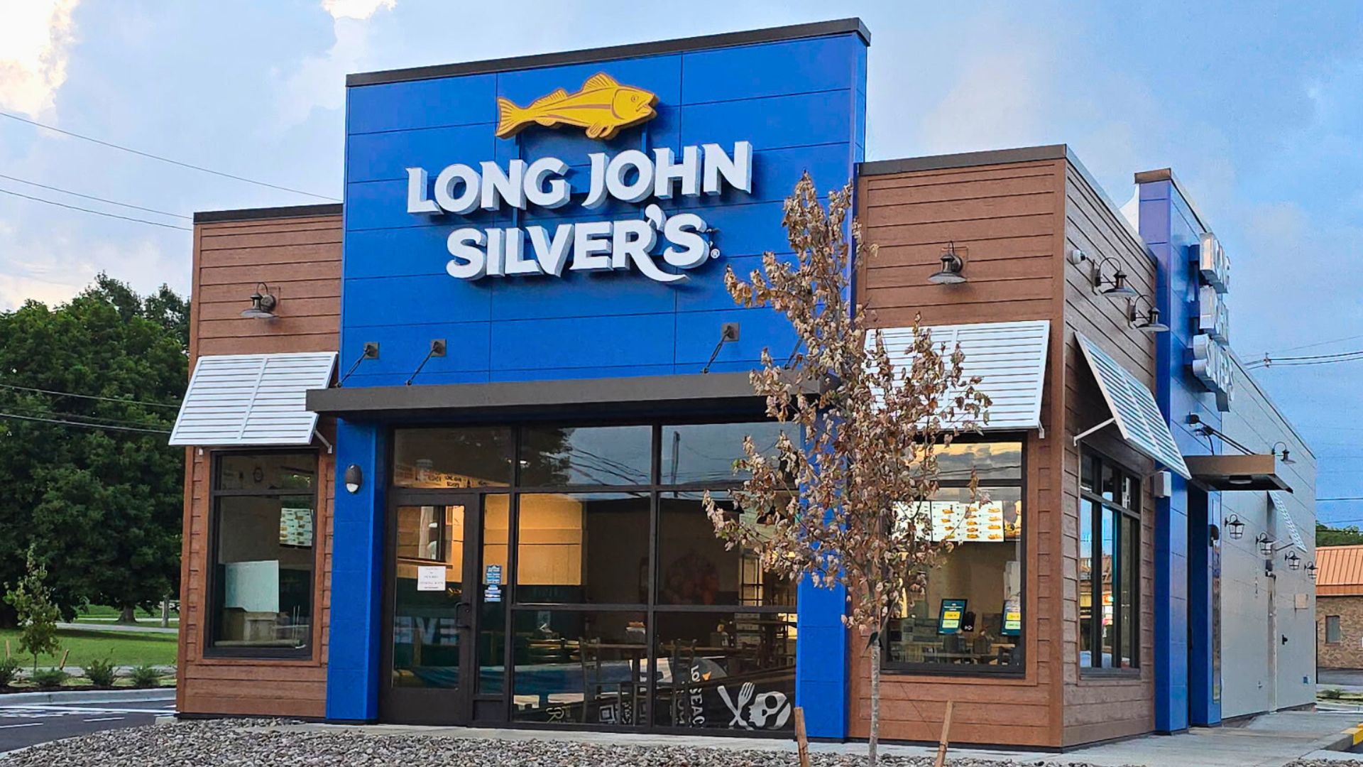
Announced on October 3, 2025, the new logo replaces the chain’s classic fish emblem with a golden chicken silhouette. According to Long John Silver’s official press release, the update reflects how customers already enjoy both chicken and seafood, while reintroducing the brand with a “fresh, modern visual identity.” Marketing VP Christopher Caudill described it as “a new chapter that honors both sides of our menu.”
The Logo Shift Explained
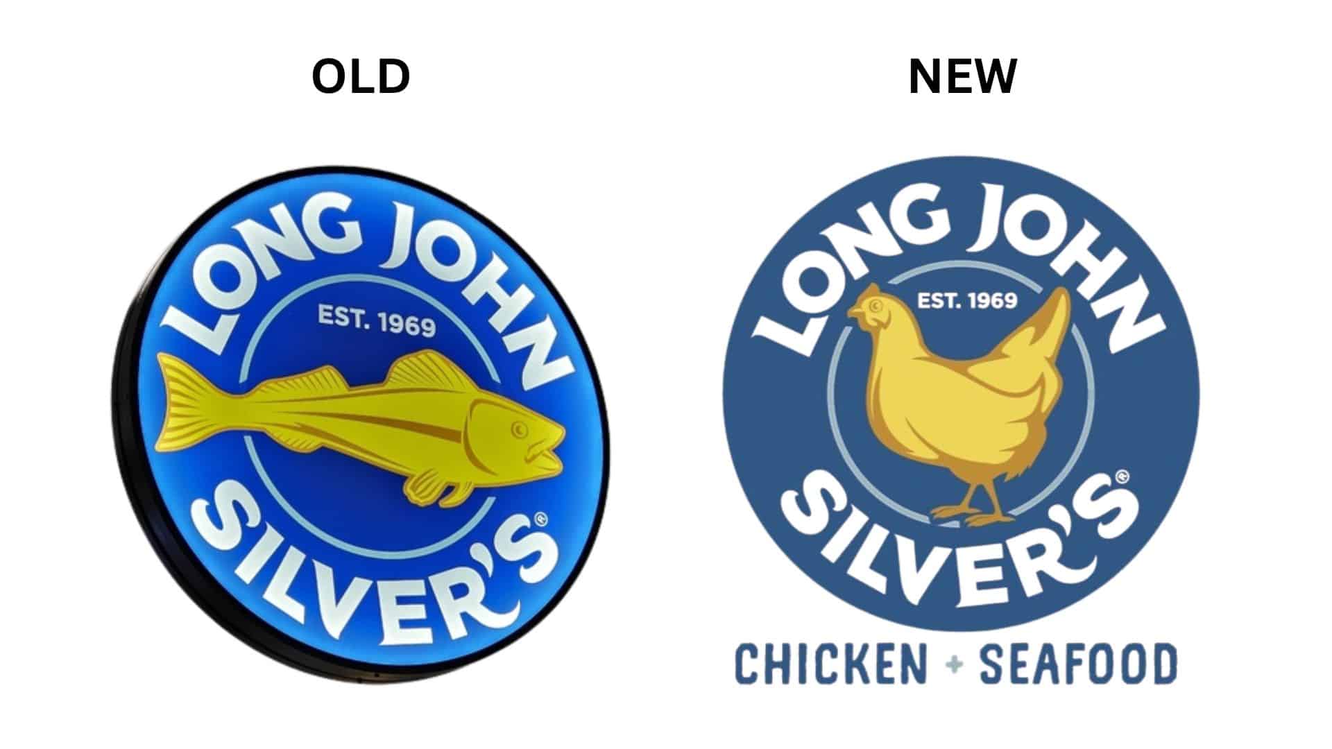
The redesigned emblem features a minimalist chicken set against a navy blue background with the words “CHICKEN + SEAFOOD.” It marks the first major change to Long John Silver’s look in nearly a decade. The company says the update celebrates the popularity of its Chicken Planks®, which Caudill calls “every bit as crave-worthy as our legendary fish.” The move is meant to reintroduce the brand to younger diners while emphasizing menu variety.
“Best-Kept Secret” Goes Mainstream
As noted in the press release, Long John Silver’s has long heard from customers that its hand-battered chicken tenders are “a best-kept secret.” To prove it, the company tested new menu items, like Nashville Hot Chicken + Seafood and Chicken Wraps, at its Louisville, Kentucky flagship store. According to the chain, the response was “overwhelmingly positive,” giving the brand confidence to bring chicken forward nationwide.
Customer Reactions: From “Bizarre” to “Branding Fail”
The rollout wasn’t smooth sailing. Fans quickly took to Facebook and Reddit to criticize the new look, calling it “bizarre,” “tone-deaf,” and even a “branding fail.” One commenter wrote, “I do love their chicken, but given the name and what they’re known for, this is incredibly stupid.” Another added, “The logo doesn’t match the brand — it’s confusing.” Others defended the move, insisting the food quality mattered more than the logo.
Nostalgia and Brand Identity Collide
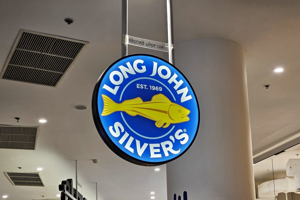
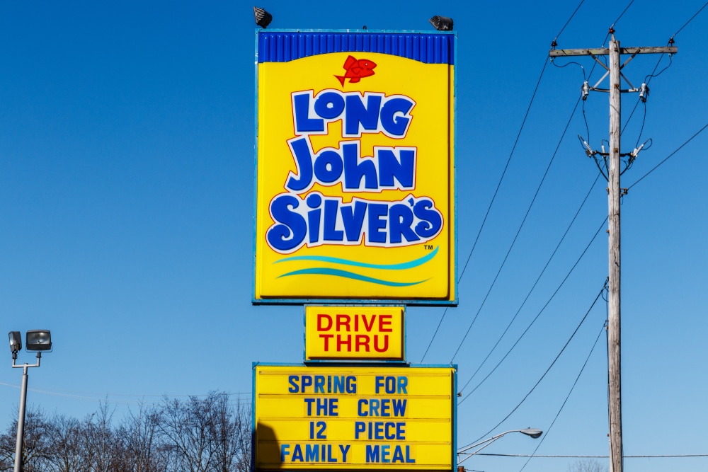
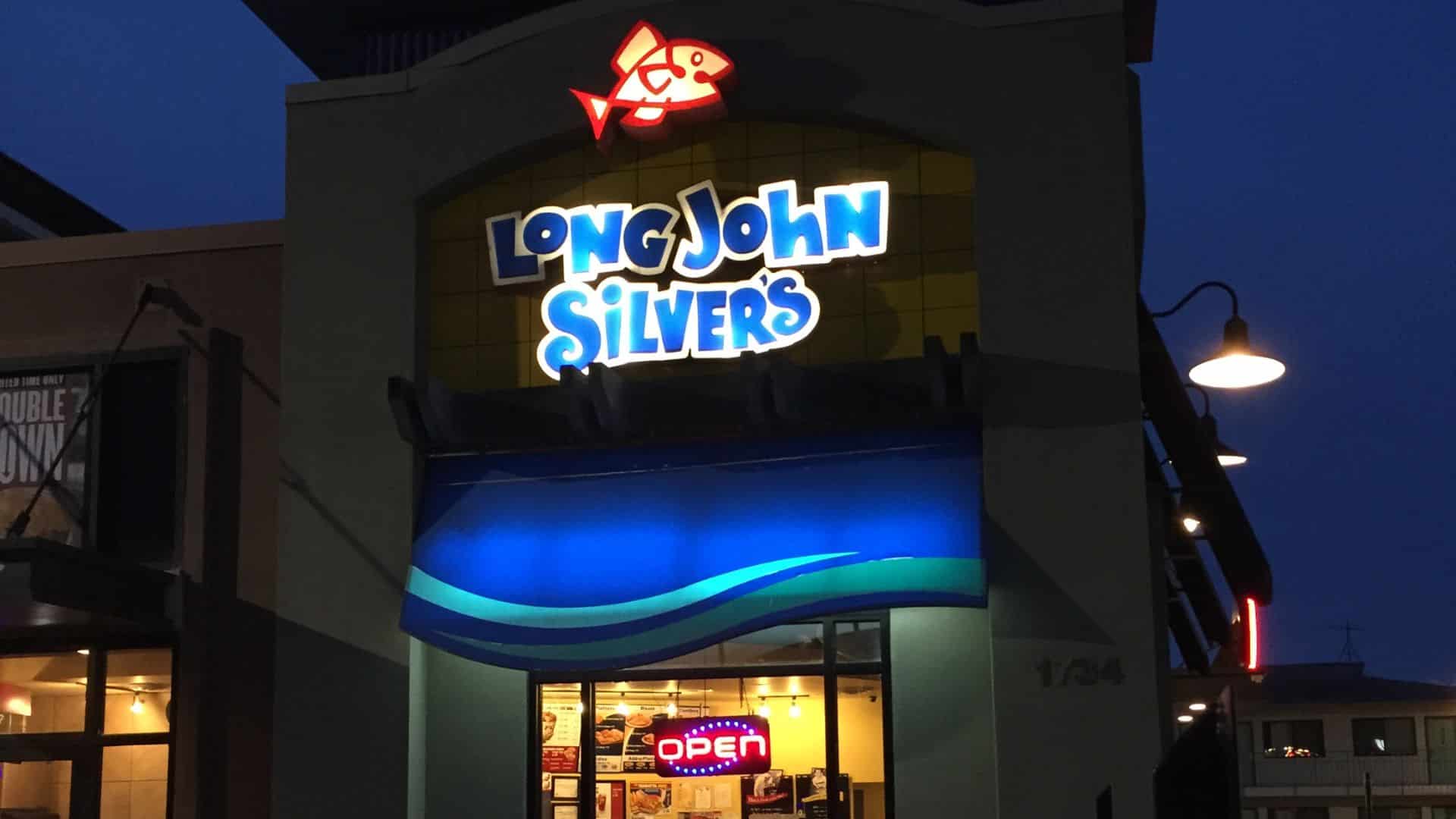
For many fans, the issue runs deeper than design — it’s about identity. Long John Silver’s has featured a fish logo for more than two decades, and the image has become a visual shorthand for the chain’s nautical, seafood roots. Replacing it with a chicken has stirred nostalgia among longtime customers who feel the fish better reflects the brand’s classic “seaside” character.
When Familiar Logos Stir Unfamiliar Reactions
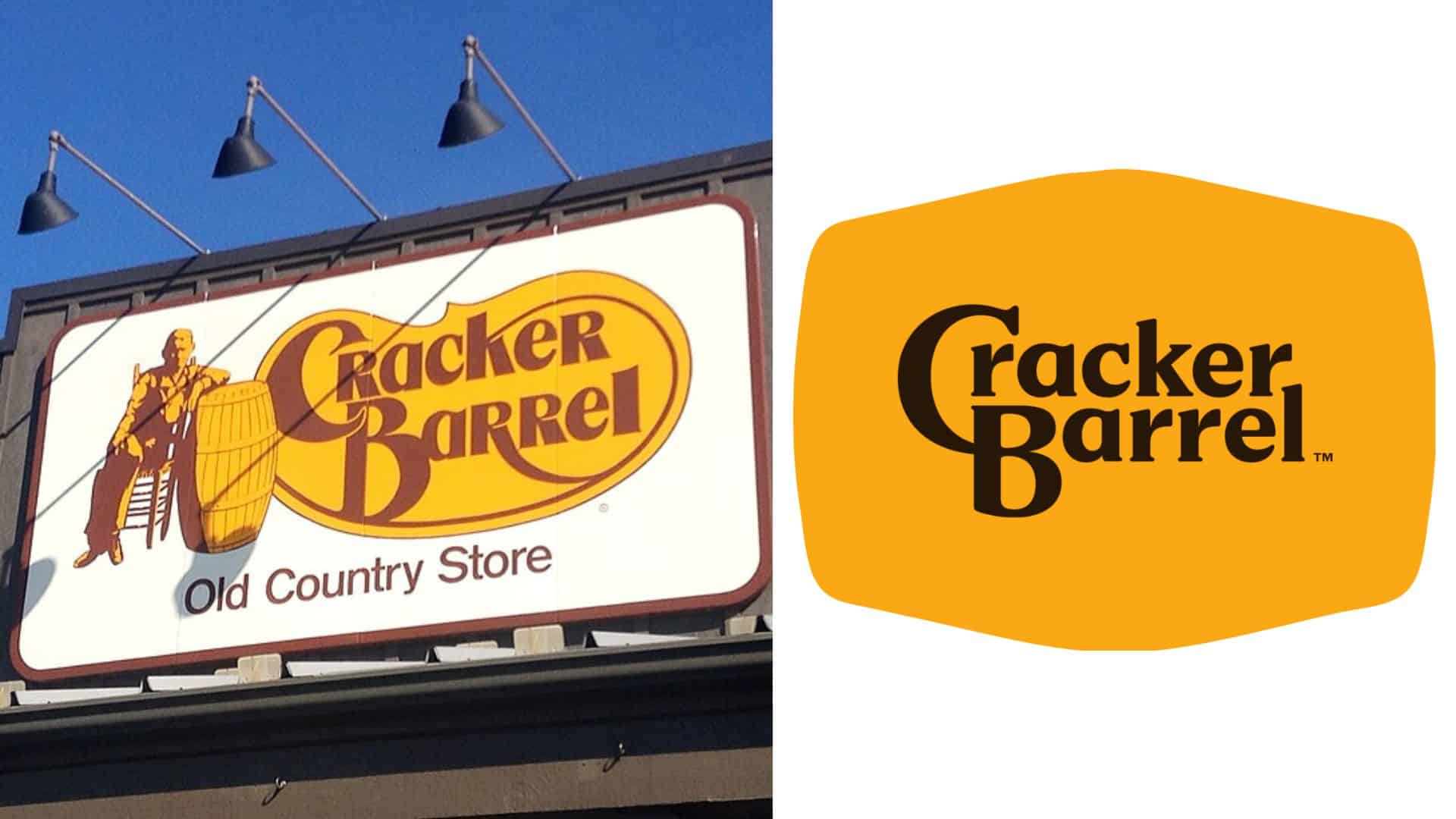
The reaction mirrors other recent logo controversies — most notably Cracker Barrel’s logo redesign, which dropped the seated man from its classic sign. The change sparked online outrage, with critics accusing the company of “erasing tradition” and “going woke,” while others defended it as routine modernization for digital platforms. Both cases reveal how even subtle design tweaks can stir strong emotional responses when heritage is at stake.
Chicken Trend in the Fast-Food World
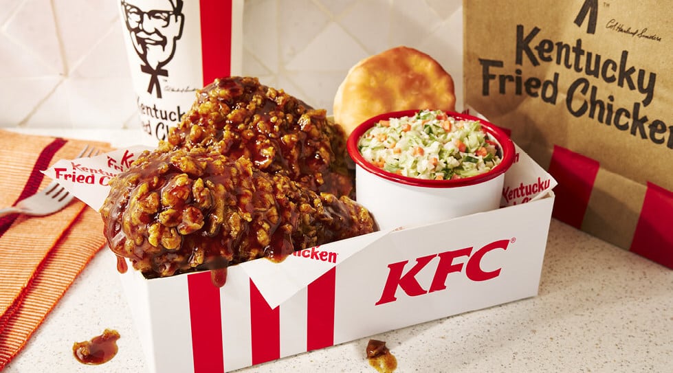
The change also reflects a wider trend across fast food. Chicken is booming — with KFC’s comeback campaigns, McDonald’s Chicken Big Mac, and Taco Bell’s new chicken wraps all hitting menus this year. Long John Silver’s hopes to tap into that same demand while broadening its image beyond seafood, positioning itself as both a coastal and comfort-food brand.
“Seafood Is Still Our DNA”
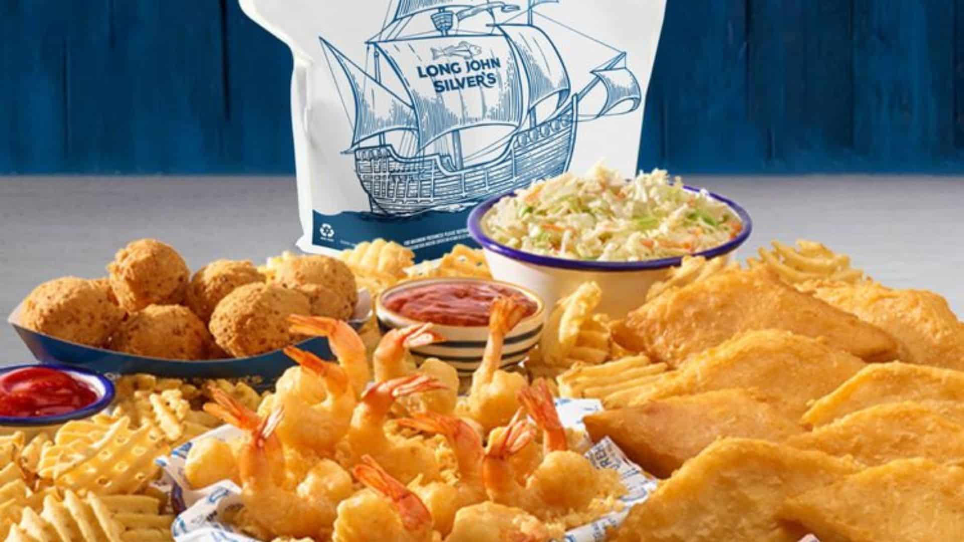
Despite the poultry-heavy pivot, the company insists it’s not abandoning its roots. “This brand was built on making the coastal experience accessible to everyone,” Caudill said in the press announcement. “Seafood will always be part of our DNA.” The menu still includes classic staples like wild-caught fish, grilled shrimp, and hush puppies — alongside new chicken-centric meals designed to bring in first-time guests.
Mixed But Viral Impact
The uproar may actually be helping the brand. As The U.S. Sun reported, the logo reveal has gone viral, giving Long John Silver’s more social media attention than it’s seen in years. Some users poked fun at the change, while others applauded it as a bold attempt to modernize. The company has leaned into the conversation, sharing behind-the-scenes photos of the new design process and teasing more menu updates to come.
Navigating Change
Long John Silver’s rebrand shows how tricky it can be to balance nostalgia and innovation. By trading its fish for a chicken, the chain made a bold statement — and a controversial one. Whether this “branding fail” turns into a success story will depend on whether fans come to see the change as evolution rather than betrayal. One thing’s clear: even after 50 years, this pirate still knows how to make waves.